Published 21 Apr 2026
Why Most Dashboards Go Unused
Business IntelligencePlaybooks

Published 21 Apr 2026
Most enterprise BI dashboards end up rarely opened, or not opened at all. That is not a fringe finding. It shows up in Gartner research, in IBM's analysis of BI adoption, and in anyone's honest audit of their own BI estate. It describes the median outcome of the last twenty years of BI investment.
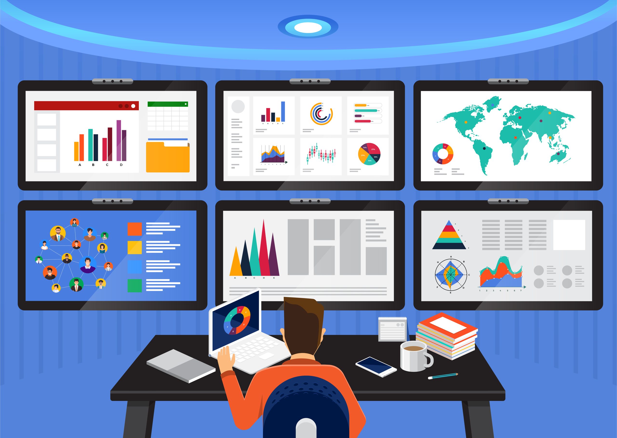
Organizations have paid for the data warehouse, the visualization tool, the consultants who built the semantic model, and the analysts who built the charts, and for the most part the charts have sat there gathering dust.
The common response is to build better dashboards, usually with cleaner layouts, fewer metrics, a design sprint with the executive team, and another round of interviews to work out what the business actually wants to see.
I have watched this play out repeatedly. The redesigned dashboards ship, adoption spikes for a week, and then the pattern resumes, with the dashboards that were opened five times a month being opened, once again, five times a month.
This is not a visualization problem. If it were, better visualization would fix it, and it does not. The answer is somewhere else.
A dashboard is a frozen answer to a question someone decided was important when the dashboard was scoped. Revenue by region. Margin by product line. Days sales outstanding by customer segment. Those are useful views, and they are also static in a way that matters.
A dashboard cannot anticipate the question you will actually ask on Tuesday morning, because the question you will ask on Tuesday morning is triggered by something moving that nobody thought to scope a view around. Decisions are rarely triggered by a metric landing on target, they are triggered by something unexpected, such as a customer paying late for the third time, a SKU that has started shipping short, or a region where win rates have softened without a clear reason. None of those show up as a headline on your BI homepage. They show up when someone is already looking for them, and by then you are already in investigation mode, which is the job a dashboard was never built to do.
None of this makes dashboards bad. They are the right tool for a defined job, broadcasting a shared operational view across a team and supporting standing rituals like the weekly revenue review or the month-end close, where the value is everyone looking at the same picture at the same time. They are also fine for monitoring, so when a pre-agreed metric breaches a pre-agreed threshold, a dashboard surfaces it, and it does that well.
The mistake is expecting dashboards to do a different job, one they were never designed to do. Most of the BI category has spent twenty years pretending otherwise, which is how we end up where we are.
The job dashboards were never designed to do is the one that actually consumes finance and operations teams. A number moves, the dashboard shows the variance cleanly and accurately in the correct color, and then three days of Excel follow while someone pulls the detail, reconciles it against two other systems, writes a narrative, builds a slide, and walks the executive team through what it means. By the time the briefing lands, the business has moved on to the next variance and the cycle starts again.
Every organization I have worked with runs this cycle. Most do not count it as BI work, because it does not happen inside the BI tool, it happens in spreadsheets and email threads and in meetings booked to figure out what the next meeting should be about. It is the largest unlabeled line item in most analytics budgets, and almost nobody is measuring it.
A different output is possible, which is where Playbooks come in. A Playbook is not a replacement for a dashboard. It is the layer above it. When a number moves, the Playbook does the investigation, explains what drove the variance, and delivers a reasoned briefing with recommended actions attached, while the dashboard keeps doing its own, narrower job.
The framing worth holding onto is monitoring layer versus decision layer, and most organizations only have the monitoring layer built out. The investigation and recommendation work still happens, it just happens manually, slowly, and without a line on the budget.
A decision layer changes what lands on an executive's desk: instead of a chart with a movement on it, a briefing with the movement already explained, the cause already traced, and the recommended next step already reasoned through. That is the output a CFO or operations leader actually needs to act. You can read more on how Playbooks sit alongside existing BI investments if that framing is useful.
If most dashboards go unused, the problem is with the yardstick, not the dashboards. Dashboards built and users logged in is a measure of activity rather than value, and it tells you nothing about whether the organization is making better decisions, which is the point. A more useful yardstick is the number of decisions a dashboard actually informed, which tends to be a much smaller number than leaders expect, and the gap between that number and the adoption number is where the real opportunity sits. Measure that and the whole conversation changes.
New to the category? Learn what decision intelligence is and why it changes how teams act on data.

Vice President, Product Marketing
21 Apr 2026
Mark Hudson is VP of Product Marketing at eyko, where he leads positioning, content, and go-to-market execution for eyko Beats and the Decision Intelligence category. He founded and successfully exited two analytics companies, Antivia (acquired by insightsoftware) and Blue Edge Software (acquired by SAP BusinessObjects). His focus is helping decision-makers move past dashboards and reports to deliver action-based outcomes that drive better decisions.
Dashboards answer questions that were known when the dashboard was scoped. Most decisions get triggered by something nobody thought to ask until a metric moved, which is why dashboards stay useful for monitoring and shared operational views without being built for the investigation work that decisions actually require.
Redesigns help briefly, with adoption spiking for a week before settling back. The underlying issue is not visualization. A frozen chart cannot anticipate the question someone will ask on Tuesday, which is why investigation work keeps spilling into spreadsheets and side meetings.
Dashboards broadcast a shared operational view for standing rituals like weekly reviews and month-end close, and they are fine for monitoring a pre-agreed metric against a pre-agreed threshold. The mistake is expecting them to handle the investigation and decision work they were never designed for.
Dashboards built and users logged in measures activity rather than value. A more useful measure is the number of decisions the dashboard actually informed, which is usually smaller than leaders think, and the gap between the two is where the real opportunity sits.
Join the enterprises replacing weeks of manual analysis with a single prompt. See what eyko Playbooks can do with your data.
The latest industry news, interviews, technologies, and resources.

You have more dashboards than ever. And yet, when it actually matters, someone still opens a spreadsheet. Decision Intelligence exists to close the gap between seeing data and knowing what to do about it.
Read post
Traditional dashboards only show what happened historically without providing context or recommended actions. Playbooks and autonomous reporting are the next evolution.
Read post